
Origins in the East and the Dawn of Paper Money Suits
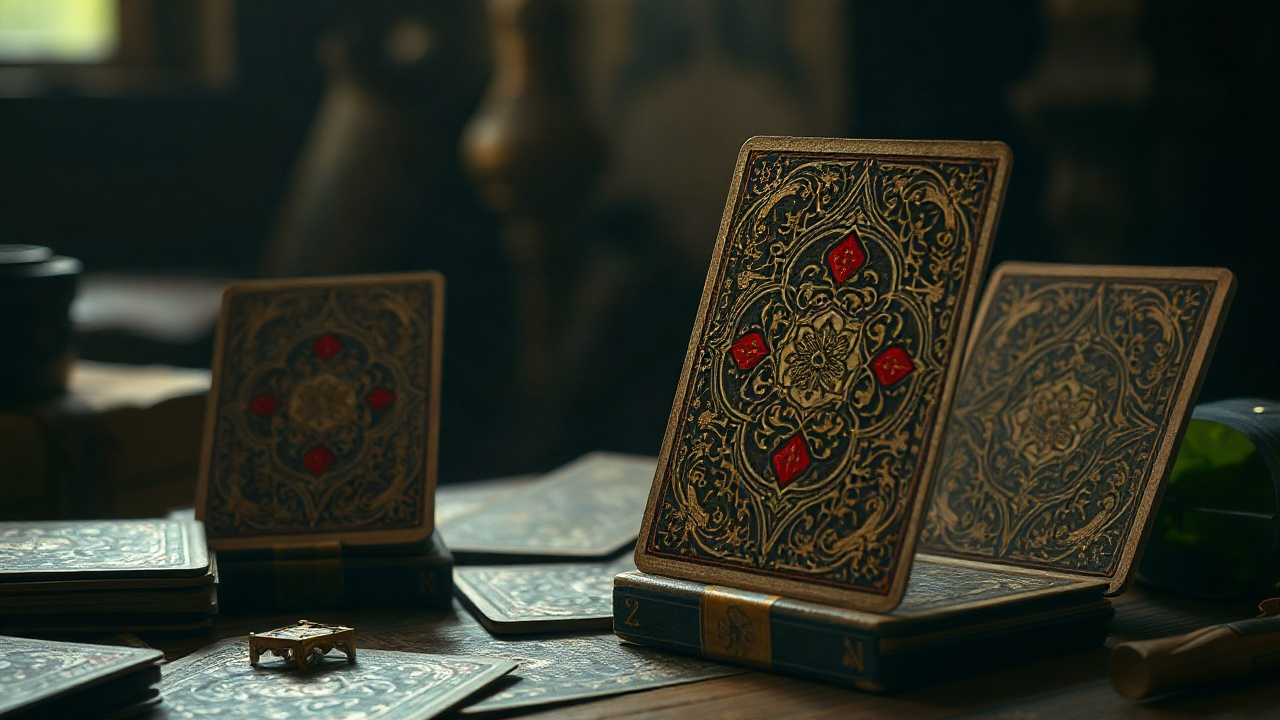
The genesis of playing cards is inextricably linked with the invention of paper in Ancient China. Long before the Four Kings graced our tables, early decks were essentially thin strips of paper or silk. These items didn’t just represent value; they were often literal copies of paper currency. The suits were based on denominations of money: strings of coins, myriads of strings, and tens of myriads. This financial origin explains why the pursuit of cards has always been associated with wealth and stakes.
Designers in the Tang and Song dynasties utilized woodblock printing to replicate these intricate patterns. The vertical orientation was a necessity, fitting comfortably in the palm of a hand. These cards were frequently decorated with scenes from popular literature, such as the Water Margin, turning a simple game into a narrative experience. The imagery was calligraphic and symbolic, relying on bold lines and minimal color palettes of red and black.
As these items traveled along the Silk Road, they underwent a fascinating transformation. The Mamluk Sultanate in Egypt adapted the Chinese concept into a structured deck that closely resembles what we use today. The Mamluk cards featured four suits: polo sticks, coins, swords, and cups. However, due to religious prohibitions against the representation of human figures, the cards featured abstract geometric patterns and beautiful calligraphy rather than faces of royalty.
The craftsmanship of Mamluk decks was extraordinary. Hand-painted with vibrant lapis lazuli and gold leaf, these cards were luxury items for the elite. The complexity of the arabesque designs ensured that each card was a unique piece of art. This tradition of high-end aesthetics laid the groundwork for the European obsession with card collecting and prestige decks.
Interestingly, the transition from Eastern to Western design saw a change in material. While the East favored thin, flexible paper, Europeans began experimenting with thicker parchment and layered paper to increase durability. This shift allowed for deeper ink penetration and the use of heavier pigments, leading to the rich, saturated colors found in early Italian and Spanish decks.
Key elements of early Eastern card design included:
- Vertical orientation for fan-style holding.
- Symbolism based on monetary denominations.
- Heavy use of red, black, and gold pigments.
- Integration of literary and mythological characters.
- Abstract geometric borders to prevent counterfeiting.
The European Renaissance and the Birth of Heraldic Suits
When cards reached Europe, they were greeted by a culture obsessed with heraldry and social hierarchy. The abstract Mamluk suits were quickly replaced by symbols that resonated with the European nobility and peasantry alike. In Italy and Spain, the suits became swords, batons, cups, and coins. These symbols were not merely random; they reflected the four pillars of medieval society: the military, the clergy, the merchants, and the nobility.
German designers, however, took a different path, opting for icons of the hunt and nature. Their decks featured acorns, leaves, hearts, and bells. The German woodcut technique allowed for mass production, making cards accessible to the common person for the first time. The imagery became more rustic and less formal, often including humorous or satirical depictions of daily life in the margins.
The Rise of the Court Cards
The introduction of human figures was a revolutionary moment in design. The King, the Knight, and the Knave (or Valet) became the standard trio. Unlike modern cards, these early figures were full-length portraits. This meant that if you held a card upside down, it was obvious to your opponent. This design flaw persisted for centuries, influencing the way players held their hands and how artists approached the canvas of a single card.
The French influence eventually simplified these complex heraldic symbols into the iconic pips we recognize today: hearts, diamonds, clubs, and spades. This simplification was a stroke of genius for mass production. Using stencils, card makers could produce decks at a fraction of the cost of hand-painted or woodcut versions. The Rouen patterns from France became the blueprint for the English deck, which is now the global standard.
| Region | Suits Used | Cultural Significance |
|---|---|---|
| Italy/Spain | Swords, Batons, Cups, Coins | Feudal social classes |
| Germany | Acorns, Leaves, Hearts, Bells | Nature and the hunt |
| France | Hearts, Diamonds, Clubs, Spades | Efficient mass production |
| Switzerland | Shields, Roses, Acorns, Bells | Regional heraldic pride |
Designers during this period began to experiment with the “King of Hearts” as a representation of specific historical figures, such as Charlemagne, while the Queen of Spades was often linked to Pallas Athena. This added a layer of educational and historical value to the decks, making them more than just gambling tools. The cards became a portable gallery of history and myth.
The Symmetry Revolution and Functional Innovations

For most of history, playing cards were uni-directional. This meant that players often had to turn their cards right-side up, a move that could tip off opponents about the strength of their hand. The mid-nineteenth century brought about the double-headed design, where court cards were mirrored across a horizontal axis. This was a massive shift in both aesthetics and functionality.
At first, the transition was met with resistance. Traditionalists felt that the mirrored images looked unnatural and cluttered. However, the practical benefits for professional gamblers and casual players alike soon outweighed the aesthetic concerns. Designers had to learn how to blend the two halves seamlessly, often using decorative belts or scepters to hide the seam at the center of the card.
Another major innovation was the introduction of corner indices. Small numbers and suit symbols in the corners allowed players to fan their cards tightly, seeing the entire hand while showing nothing to others. Before this, players had to spread their cards wide to see the central pips. This seemingly small design change completely altered the mechanics of card games like poker, which relied heavily on secrecy and bluffing.
The materials also evolved. The introduction of varnish and plastic coatings meant that cards could survive the spill of a drink or the sweat of a nervous palm. The tactile feel of a deck—its “snap” and its ability to slide smoothly—became a hallmark of quality. Brands like Bicycle and Bee began to dominate the market, focusing on standardized, reliable designs that players could trust.
Evolutionary milestones in card layout included:
- Double-headed court cards for readability from any angle.
- Corner indices for tighter fanning and secrecy.
- Rounded corners to prevent fraying and delamination.
- Linen-finish paper for better air-cushioning and shuffling.
- Standardized back patterns to hide manufacturing flaws.
The Aesthetics of the Back Design and Anti-Cheating Measures
While the faces of the cards tell a story, the backs are equally important. Early cards often had plain white backs, but this was a security nightmare. Any small smudge, scratch, or ink splatter could “mark” a card, giving an unfair advantage to those who could spot the flaw. To combat this, designers began creating complex, symmetrical patterns that covered the entire reverse side.
The classic “Rider Back” design by Bicycle is a prime example of this functional art. It features intricate scrolls, cherubs on bicycles, and floral motifs. The complexity makes it nearly impossible to mark the card without it being obvious. The symmetry ensures that the card looks the same even if it is rotated, preventing players from tracking the orientation of specific cards in the deck.
The Role of Borders
Designers must also decide between bordered and borderless backs. Bordered cards have a white margin, which is excellent for detecting second-dealing and other sleight-of-hand tricks. Borderless cards, where the pattern bleeds to the edge, are favored by some for their seamless look during flourishes but are generally avoided in high-stakes casino play because they are easier to mark on the edges.
Casinos take this design a step further by using security ink and custom logos. Every casino has its own unique back design, often featuring high-contrast colors and microscopic details that are difficult to replicate. These cards are used for a limited time before being cancelled—often by drilling a hole through the center or clipping the corners—to ensure they don’t find their way back into a live game.
The color of the back also plays a psychological role. Red and blue are the traditional choices, offering the highest contrast against the green felt of a gambling table. Modern luxury decks have experimented with gold foil, holographic finishes, and even thermochromic ink that changes color with the heat of the hand, pushing the boundaries of what a card back can be.
The Golden Age of Advertising and Souvenir Decks
In the late nineteenth and early twentieth centuries, playing cards became a premier medium for advertising. Because a deck of cards stayed in a household for years, it was the perfect “billboard” for brands. Companies began commissioning custom back designs featuring everything from soft drinks to railway lines. These weren’t just logos; they were often beautiful illustrations of landscapes or industrial progress.
Souvenir decks also became a massive trend. Travelers could buy decks featuring photographs of the Grand Canyon, the Eiffel Tower, or exotic colonial outposts. Each card in the deck would feature a different image, making the deck a portable photo album. This required a shift in design philosophy, as the central imagery had to be balanced with the functional pips in the corners.
Transformation Decks
One of the most creative chapters in card design is the transformation deck. In these sets, the artist incorporates the pips (the hearts, diamonds, etc.) into a larger illustration. For example, the three of hearts might be transformed into the faces of three blooming flowers, or the ten of clubs might become the spots on a group of Dalmatians. These decks were highly prized for their wit and artistic ingenuity.
The challenge for the designer was to maintain the playability of the card while hiding the pips in plain sight. This required a deep understanding of negative space and composition. Today, transformation decks are rare and highly sought after by collectors, representing a time when card design was a playful dialogue between the artist and the user.
Benefits of custom advertising decks included:
- High retention rate in the consumer’s home.
- Tactile engagement with the brand during leisure time.
- Potential for viral spread as decks were shared among friends.
- Ability to showcase a wide range of products across 52 cards.
- Association of the brand with positive social experiences.
The Modern Minimalist Movement and High-End Luxury
In recent years, a new wave of designers has reimagined the playing card for the minimalist era. These decks often strip away the centuries of heraldic tradition in favor of clean lines, geometric shapes, and bold typography. The goal is to reduce the card to its essential elements while maintaining its functionality. This movement has been driven largely by the cardistry community—artists who perform complex shuffling and manipulation stunts.
For cardists, the design is all about how the cards look in motion. High-contrast geometric patterns on the backs create stunning visual effects during spins, fans, and cuts. The faces are often simplified so as not to distract from the movement. Brands like Virtuoso and Fontaine have built entire cult followings around these minimalist, performance-oriented designs.
Luxury Materials and Finishing Techniques
On the opposite end of the spectrum is the rise of the luxury collector’s deck. These are not meant for a Saturday night poker game but are pieces of fine art. Designers use premium materials like black matte cardstock, metallic foils, and even 3D-embossed tuck cases. The tuck case—the box the cards come in—has become as important as the cards themselves, often featuring interior printing and custom seals.
The printing technology has also advanced. Cold foil printing allows for metallic effects that don’t interfere with the card’s handling. Soft-touch laminates give the cards a velvety feel, while laser-cutting allows for intricate patterns that were previously impossible to achieve. These decks often explore deep thematic concepts, from Norse mythology to cyberpunk futures, using the 52 cards as a canvas for world-building.
| Feature | Traditional Deck | Modern Luxury Deck |
|---|---|---|
| Paper Stock | Standard wood pulp | FSC-certified casino grade |
| Ink Type | Standard offset ink | Metallic, neon, or UV-reactive |
| Tuck Case | Simple cardboard | Multi-layered foil and embossing |
| Purpose | Gameplay | Collection and Cardistry |
| Art Style | Standardized Rouen pattern | Custom thematic illustrations |
The Psychological Impact of Color and Shape in Card Design

Why is the King of Hearts always red? Why are Spades considered “higher” in some games? The psychology of card design is a subtle but powerful force. Red is associated with heat, emotion, and urgency, making hearts and diamonds feel more “active.” Black, conversely, represents stability, shadow, and power, giving spades and clubs a more grounded, authoritative feel.
The shapes of the pips also play a role in how we perceive the game. The sharp angles of the diamond suggest precision and value, while the rounded lobes of the club feel more organic and common. Designers use these psychological cues to guide the player’s eye. In many modern decks, designers experiment with four-color suits (adding green for clubs and blue for diamonds) to reduce mistakes in fast-paced games, though traditionalists often find this jarring.
Furthermore, the facial expressions of the court cards are meticulously crafted. The “Suicide King” (the King of Hearts, who appears to be pointing a sword at his head) or the “One-Eyed Jacks” create a sense of personality and mystery. These small details have inspired countless urban legends and theories, proving that even a tiny illustration on a piece of cardboard can capture the collective imagination.
Tips for choosing a deck based on design psychology:
- Use high-contrast traditional colors for competitive play to avoid fatigue.
- Select minimalist designs for focused practice or meditation.
- Opt for warm, gold-toned decks for social gatherings to create a cozy atmosphere.
- Choose cool, dark-themed decks for magic tricks to enhance a sense of mystery.
- Look for larger indices if playing in low-light environments.
The Future of Playing Cards: Digital and Hybrid Designs
As we move further into the digital age, the design of playing cards is facing its next evolution. NFC-enabled cards are already being used in some high-end environments to track every move on the table, allowing for real-time data analysis and broadcasting. The design must now incorporate hidden tech without compromising the weight or balance of the card.
Augmented Reality (AR) is another frontier. Some designers are creating decks where, when viewed through a smartphone, the characters on the cards come to life in 3D. A King might brandish his sword, or a Queen might whisper a secret. This turns the deck into a bridge between the physical and digital worlds, opening up new possibilities for storytelling and immersive gaming.
However, despite these technological leaps, the core of playing card design remains rooted in the tactile. The way a card feels when it is snapped against a table, the smell of fresh ink, and the visual rhythm of a well-shuffled deck are experiences that digital screens cannot fully replicate. The future of card design likely lies in a hybrid approach: using modern technology to enhance the physical beauty and security of the deck while honoring the centuries of history that brought us here.
The enduring appeal of the playing card is its versatility. It is a tool for gambling, a prop for magic, a canvas for art, and a medium for social interaction. Whether it’s a centuries-old Chinese strip or a holographic modern masterpiece, the design of the playing card continues to be a reflection of human culture, ingenuity, and our eternal love for the game.