
The Architect of Glamour: How Mid-Century Design Defined the Strip
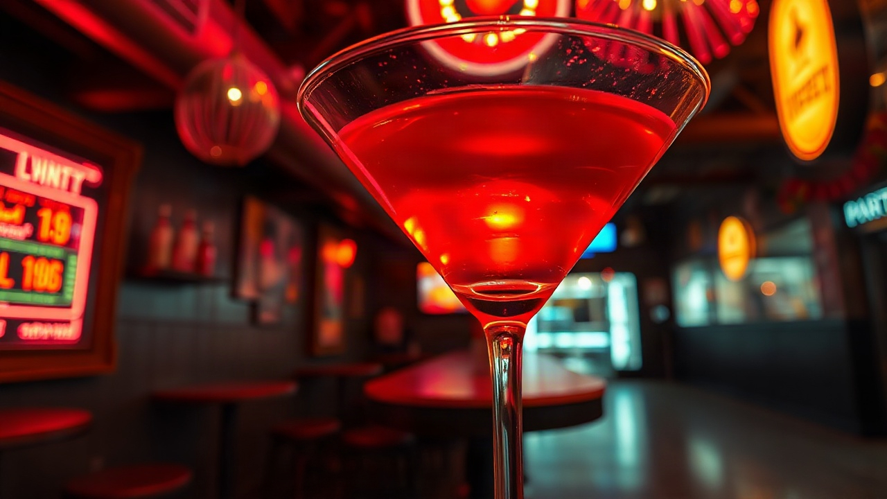
The visual identity of the desert oasis underwent a radical transformation during the middle of the last century. Architects and designers shifted away from the rustic ‘Old West’ theme that dominated early establishments, embracing a futuristic, sleek aesthetic known as Googie. This style featured upswept roofs, geometric shapes, and a sense of movement that mirrored the space-age optimism of the era. This architectural shift was not merely about buildings; it was about creating a cohesive atmosphere of luxury and excitement that felt entirely disconnected from the mundane reality of everyday life.
Online game developers today look back at this period to understand the psychology of ‘the escape.’ By replicating the bold angles and extravagant silhouettes of mid-century resorts, modern interfaces immediately signal a premium experience. The use of vast, open layouts and clean lines in digital lobbies draws directly from the floor plans of legendary venues. This structural clarity helps players navigate complex gaming ecosystems without feeling overwhelmed, mimicking the intuitive flow of a well-designed casino floor.
Materiality played a crucial role in the 60s aesthetic. Chrome, glass, and velvet were the primary textures. In the digital realm, these materials are translated into high-fidelity shaders and lighting effects. The way a virtual slot machine reflects a neon light source is a direct nod to the polished surfaces of the past. These textures evoke a sense of tactile reality that makes the digital environment feel substantial and valuable.
The color palette of this era was equally intentional. Deep burgundies, gold accents, and turquoise shades created a specific mood of sophisticated rebellion. Online games utilize these historical color schemes to establish a brand identity that feels both classic and energetic. By avoiding the flat, sterile colors of modern corporate design, developers tap into a nostalgic reservoir that associates their product with the legendary ‘Golden Age’ of entertainment.
Furthermore, the integration of landscaping, such as the iconic palm trees and fountain displays, added a layer of artificial paradise. Digital games often use these environmental cues in their backgrounds to enhance the ‘resort’ feel. It is about creating a world where the sun never sets, and the party never ends, a concept perfected in the 60s and refined in today’s pixels.
Finally, the sense of scale was paramount. The massive marquees that towered over the desert floor were designed to be visible from miles away. This philosophy of ‘bigger is better’ is mirrored in the way online gaming platforms present their jackpots and major events. The visual hierarchy is dominated by large, glowing elements that demand attention, ensuring the most important information is never missed by the user.
The Psychology of Neon: Why Glowing Tubes Still Capture Attention
Neon is more than just a lighting technique; it is a visual language that communicates availability, excitement, and a touch of the forbidden. In the 1960s, the saturation of the Strip with gas-filled glass tubes turned the desert night into a neon forest. This ‘Electric Eden’ utilized specific wavelengths of light that are scientifically proven to stimulate the human brain, triggering feelings of alertness and anticipation. Modern game designers use these same principles by applying ‘bloom’ and ‘glow’ effects to their most critical interactive elements.
The unique quality of neon light lies in its warmth and its imperfections. Unlike the cold, uniform light of modern LEDs, neon has a slight flicker and a soft edges. Digital artists often go to great lengths to simulate these imperfections—the subtle hum, the way the light spills onto nearby surfaces, and the slight lag when a sign turns on. This attention to detail creates a sense of ‘lived-in’ luxury that feels more authentic than perfect, flat digital graphics.
Colors in neon have specific cultural meanings. Pink and purple neon suggests a nightlife atmosphere and high-end exclusivity, while green and gold often represent wealth and luck. By carefully selecting the ‘neon’ accents in a game’s UI, developers can subtly guide the player’s emotional state. For example, a high-stakes area might be bathed in deep violet, while a bonus round might erupt in vibrant flashes of emerald and gold.
The persistence of neon in online gaming is also a matter of contrast. Most digital screens are viewed in environments with variable lighting. The high-contrast nature of ‘neon on black’ ensures that game elements remain legible and striking regardless of the user’s physical surroundings. It is a functional design choice as much as an aesthetic one, providing clear visual feedback in a fast-paced gaming environment.
Moreover, neon is synonymous with the ‘open’ sign. It signals that the action is happening now. In an industry where engagement is key, the constant glow of virtual neon acts as a lighthouse for players, signaling a 24/7 destination where the doors are never locked. This creates a psychological sense of a persistent, living world that exists beyond the moment the player logs off.
The following table illustrates how specific neon colors are used in digital game design to influence player perception:
| Neon Color | Psychological Trigger | Common Digital Application |
|---|---|---|
| Electric Blue | Trust and Stability | Standard Menu Borders & Navigation |
| Vibrant Pink | Excitement and Energy | Limited Time Events & Hot Zones |
| Emerald Green | Wealth and Prosperity | Jackpot Displays & Payout Animations |
| Golden Yellow | Luxury and Prestige | VIP Lounges & Premium Currency |
| Crimson Red | Urgency and Heat | High Stakes Warning & Risk Indicators |
Typography of the Strip: Fonts that Scream High Stakes
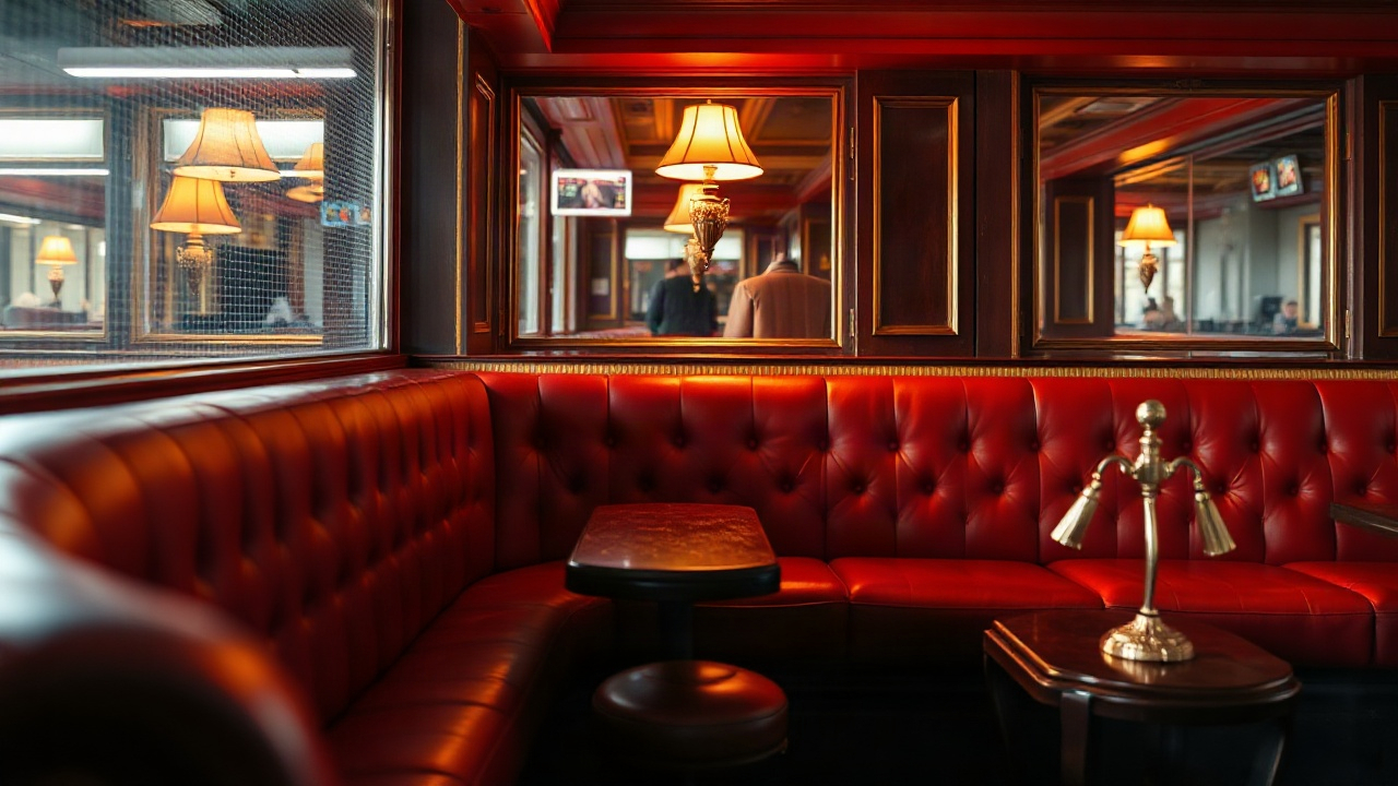
The lettering used in 60s Las Vegas was a riot of creativity, blending cursive elegance with bold, blocky sans-serifs. These fonts were designed to be read from a moving car at night, leading to the development of highly legible yet expressive typefaces. Online games frequently adopt these styles to evoke a retro-cool atmosphere. Script fonts that look like hand-written signatures suggest a personal touch and a sense of ‘old-world’ service, even in a fully automated digital environment.
One of the most recognizable styles is the ‘marquee’ font, where each letter is composed of individual light bulbs. This style is ubiquitous in online slots and tournament headers. It creates a celebratory mood, as if every win is being broadcast to a cheering crowd. The ‘chase’ effect, where lights appear to run around the edge of the letters, adds a layer of kinetic energy that static fonts simply cannot match.
In the 1960s, typography was often integrated directly into the architecture. Similarly, in modern game UI, the text is rarely just an overlay. It is treated as a 3D object with depth, shadows, and reflections. This ‘objectification’ of text makes the information feel like a physical part of the game world, increasing the immersion for the player. When a ‘Big Win’ message appears, its font choice and animation are the primary drivers of the player’s dopamine response.
The contrast between different typefaces is also used to establish a hierarchy of information. A heavy, slab-serif font might be used for the name of the game, suggesting strength and tradition, while a sleek, monolinear script is used for ‘Join Now’ or ‘Play’ buttons, suggesting ease of use and modern fluidity. This sophisticated use of typography is a direct legacy of the graphic designers who populated the desert with competing messages in the mid-century.
Furthermore, the use of ‘atomic’ or ‘space-age’ fonts—characterized by unusual curves and futuristic crossbars—taps into the era’s obsession with the future. This gives a game a ‘retro-futuristic’ vibe that feels timeless. It bridges the gap between the nostalgia for the past and the technology of the present, making the game feel like a classic that has been updated for the modern age.
To implement this effectively, designers follow a specific checklist to ensure typographic harmony:
- Limit the use of decorative script fonts to titles and headers only.
- Ensure a high contrast between the font color and the neon glow background.
- Use ‘bulb’ effects sparingly to highlight the most important player achievements.
- Maintain consistent letter spacing to preserve legibility on smaller mobile screens.
- Avoid overly thin fonts that might disappear behind heavy glow or bloom shaders.
The Concept of the ‘Virtual Vault’: Sound and Sensory Immersion
While the visual style of 60s Vegas is undeniable, the sensory experience was equally defined by its sounds. The mechanical clatter of coins, the rhythmic spinning of reels, and the ambient lounge music created a specific acoustic environment. Modern online games meticulously recreate these sounds to trigger the same psychological responses. Even when there are no physical coins involved, the ‘clink’ of a digital win provides a necessary tactile feedback loop.
The musical choices in Vegas-themed games often lean toward ‘Bossa Nova’, jazz, or big-band swing. This music is designed to be ‘wallpaper’—pleasant, sophisticated, and steady. It lowers the player’s stress levels and encourages a longer session. In the 60s, this was the sound of the lounge; today, it is the sound of the digital lobby. The tempo is carefully managed to match the pace of the game, speeding up during ‘hot streaks’ and slowing down during periods of calm.
Sound effects also serve as a navigational tool. Specific chimes and tones signify different events, such as a level-up or a bonus trigger. These sounds are often synthesized to mimic the analog oscillators used in early electronic equipment, adding another layer of 60s authenticity. The ‘warble’ of a vintage synthesizer feels more organic and inviting than a sharp, modern digital beep.
Ambient noise is another trick pulled from the 60s playbook. Many high-end online gaming platforms include a subtle layer of ‘room tone’—the faint murmur of a crowd, the distant sound of other machines, and the clinking of glasses. This creates a sense of being in a social space, reducing the feeling of isolation that can sometimes accompany online play. It simulates the energy of a crowded casino floor, making the player feel like they are ‘where the action is.’
The synchronization of sound and light is what truly sells the experience. When a neon sign ‘flickers’ in the game, the sound of a small electrical buzz is often included. When a reel stops, the ‘thud’ is heavy and satisfying. This ‘audiovisual synesthesia’ reinforces the reality of the digital world, making the user’s interactions feel impactful and ‘real.’
Developers use the following audio-visual sync strategies to enhance the ‘Vegas’ feel:
- Layering ‘analog’ hiss over digital music tracks for a vintage vinyl feel.
- Using spatial audio to make ambient casino noises sound like they are coming from behind the player.
- Matching the frequency of light flickers with subtle static sound effects.
- Varying the pitch of ‘win’ sounds to keep the experience fresh over long periods.
The Iconography of Luck: Symbols That Transcend Time

The 1960s cemented a specific set of symbols in the global consciousness as the universal language of gaming. Cherries, lemons, bells, and the ‘Lucky 7’ were not just random choices; they were part of a visual shorthand that was easy to recognize and understand across different cultures and languages. Modern online games continue to use these symbols because they require zero explanation. They carry an inherent ‘weight’ of tradition that makes the game feel legitimate.
Beyond the fruit symbols, the 60s introduced the iconography of the ‘High Roller’—martini glasses, cigars, luxury cars, and sparkling jewelry. These symbols are used in modern games to create a narrative of aspiration. They aren’t just buttons or icons; they are pieces of a story about a lifestyle of glamor and success. When a player sees these symbols, they aren’t just playing a game; they are participating in a fantasy of the ‘Vegas Dream.’
The starburst or ‘glimmer’ effect is another iconic visual cue from this era. Often seen on signs like the famous ‘Welcome to Fabulous Las Vegas,’ the four-pointed star signifies magic and possibility. In digital UI, this starburst is used as a ‘particle effect’ to celebrate wins or to highlight new features. It is a simple geometric shape that carries a massive amount of positive emotional baggage.
Card suits—hearts, diamonds, clubs, and spades—were also stylized in the 60s with bold, saturated colors and slightly rounded edges. Modern designers often revisit these vintage versions of the suits to give their games a more ’boutique’ feel. It distinguishes their product from more generic, modern-looking card games. The goal is to make every element of the screen look like it was designed by a master graphic artist from the 1966 California design scene.
Finally, the ‘Golden Ratio’ and specific geometric patterns like the harlequin or diamond grid were staples of 60s floor and wall coverings. These patterns are frequently used as subtle backgrounds in online game interfaces. They provide a sense of structure and rhythm without distracting from the main action. They ground the flashy neon elements in a classic design framework.
Why Iconic Symbols Matter for User Retention
Using recognizable icons reduces the ‘cognitive load’ on the player. When a user logs into a new game, they don’t want to spend time learning a new set of rules or symbols. By using the ’60s lexicon,’ developers allow the player to jump straight into the fun. This familiarity breeds comfort, and comfort leads to longer playing sessions and higher brand loyalty.
The ‘Lounge’ Interface: User Experience Inspired by 60s Hospitality
In the 1960s, the Vegas experience was centered around service and the ‘host.’ Everything was designed to make the guest feel like the most important person in the room. Modern online games translate this ‘host culture’ into their User Experience (UX) design. The interface is not just a tool; it is a digital concierge. Menus are designed to be ‘tucked away’ but easily accessible, mimicking the unobtrusive but attentive service of a high-end lounge.
Personalization is a key component of this approach. Just as a 60s pit boss might remember a regular’s favorite drink, modern games use data to personalize the lobby for each player. Showing recently played games, suggesting new ones based on taste, and offering tailored ‘loyalty’ rewards are all digital versions of the ‘comp’ system developed in the mid-century. This makes the player feel seen and valued, increasing the ‘stickiness’ of the platform.
The ‘VIP’ experience is the ultimate expression of this 60s hospitality model. Modern games often feature tiered loyalty programs with names that evoke the era—’Gold Room,’ ‘Diamond Lounge,’ or ‘Platinum Club.’ These areas of the site often feature a distinct aesthetic shift toward even more luxurious colors, such as deep emerald or rich gold, and exclusive music tracks. It creates a ‘club within a club’ atmosphere that players strive to join.
Navigation in these games is designed to be ‘frictionless.’ In a 1960s casino, you were never more than a few steps away from a game, a drink, or a show. In a modern gaming app, the ‘Deposit’ button, the ‘Help’ center, and the game library are always within a single tap. This eliminates frustration and keeps the ‘flow state’ intact. The design philosophy is simple: keep the player in the world by removing any reason for them to leave.
Even the ‘Terms and Conditions’ or ‘Rules’ sections are often given a 60s makeover. Instead of a wall of dry text, they might be presented as a vintage pamphlet or a stylized ‘contract’ on a clipboard. This attention to detail ensures that even the most mundane parts of the experience don’t break the immersion. Every touchpoint is an opportunity to reinforce the theme.
Comparison of Traditional vs. 60s-Themed Digital UX
| UX Element | Modern Corporate Style | 60s Vegas ‘Lounge’ Style |
|---|---|---|
| Navigation Menus | Hidden ‘Hamburger’ Icons | Integrated, Stylized Sidebars |
| Player Feedback | Simple Text Notifications | Animated ‘Host’ Messages & Glows |
| Loyalty Programs | Points & Levels | Exclusive ‘Lounges’ & Status Tiers |
| Load Screens | Spinning Circles | Vintage Posters or Neon Animations |
| Button Design | Flat & Minimalist | 3D, Beveled with Glow Effects |
The ‘Atmospheric’ Gamble: Why Lighting Trumps Graphics

One of the biggest lessons developers learned from 60s Las Vegas is that lighting is more important than raw graphic fidelity. A low-polygon model can look stunning if it is lit correctly, whereas a high-fidelity model can look ‘dead’ if the lighting is flat. The 60s were the era of ‘mood lighting.’ Casinos had no windows and no clocks, creating an artificial ‘twilight’ that existed 24/7. Online games replicate this by using ‘global illumination’ and ‘volumetric lighting’ to create a thick, moody atmosphere.
Shadows are used strategically to create depth. In a virtual Vegas lobby, the shadows aren’t just black; they are often tinted with the color of the nearest neon sign—a purple shadow here, a green one there. This ‘color bleed’ is a hallmark of the 60s night scene and adds a layer of visual complexity that makes the digital world feel three-dimensional and ‘warm.’
The use of ‘dynamic’ lighting—where the light changes based on what is happening on screen—mimics the way a physical neon sign would illuminate the street. When a player wins, the entire ‘room’ might brighten, or the colors might shift rapidly. This environmental feedback makes the player feel the ‘impact’ of their actions on the entire game world, not just on a small part of the screen.
Reflections are the ‘secret sauce’ of the Vegas aesthetic. Whether it is the reflection of a neon sign in a virtual puddle on the ‘pavement’ or the way the light glints off a virtual gold coin, these tiny details tell the brain that the environment is real. Developers use ‘ray tracing’ technology to simulate these reflections in real-time, creating a visual feast that is incredibly hard to look away from.
The ‘glow’ effect, or ‘bloom,’ is perhaps the most overused yet effective tool in the kit. By allowing bright lights to ‘spill’ over their borders, designers create a sense of intensity and power. It mimics the way the human eye reacts to bright light in a dark room. This ‘over-saturation’ of light creates a feeling of sensory overload that is synonymous with the excitement of a high-stakes environment.
Checklist for Achieving ‘Vegas’ Lighting in Games
- Use ‘warm’ light sources (oranges, reds, yellows) for interactive areas.
- Apply ‘cool’ rim lighting (blues, purples) to separate objects from the background.
- Ensure every light source has a corresponding ‘spill’ or ‘bloom’ effect.
- Use flickering light animations to simulate vintage gas-filled tubes.
- Incorporate reflective surfaces (chrome, marble, glass) to double the impact of neon.
The Social Layer: Creating a Digital ‘Rat Pack’ Vibe
The 1960s in Vegas were defined by the ‘Rat Pack’—the idea of a group of cool, sophisticated friends having the time of their lives. Modern online games attempt to foster this same sense of community. It isn’t just about the player against the machine; it’s about the player being part of an elite social circle. This is achieved through integrated chat systems, ‘friends’ lists, and multiplayer tournaments that feel like exclusive parties.
The language used in these social features often leans into the 60s slang or vibe. Players are called ‘High Rollers,’ ‘Legends,’ or ‘A-Listers.’ This nomenclature creates an ‘in-crowd’ feeling, making the player feel like they are part of something special. It transforms a solitary activity on a smartphone into a social event that people want to be seen at.
Avatars and player profiles are another area where the 60s aesthetic shines. Many games offer vintage-style clothing, ‘cool’ hairstyles, and retro accessories for players to customize their digital presence. This allows players to ‘dress up’ for the virtual casino, just as people would have done in 1965. This role-playing element adds a layer of depth and engagement that goes beyond the core gameplay mechanics.
Leaderboards are presented as ‘Headliners’ or ‘Marquee Stars.’ This subtle shift in naming changes the motivation from simple competition to a quest for ‘fame.’ In the 60s, being a headliner was the pinnacle of success; in the digital world, seeing your name in ‘neon’ at the top of the leaderboard provides the same psychological payoff.
Finally, the ‘Live Dealer’ phenomenon is the ultimate bridge between the 60s and the modern day. By streaming a real person in a stylized, 60s-themed studio, online games provide the human connection that was so vital to the original Vegas experience. The dealers are often dressed in retro attire, and the studios are bathed in neon light, creating a seamless blend of physical reality and digital fantasy. This ‘hybrid’ experience is currently one of the most successful segments of the online gaming industry precisely because it captures the ‘soul’ of the Vegas Strip.
The Longevity of the Glow: Why This Style Will Never Die
Trends in design come and go, but the 60s Vegas aesthetic has proven to be remarkably resilient. This is because it is not just a ‘style’; it is a meticulously crafted psychological environment designed to maximize excitement, comfort, and engagement. As long as humans are wired to respond to bright lights, warm colors, and the promise of a ‘big win,’ the neon glow of the desert will continue to be the gold standard for gaming design.
The transition to Virtual Reality (VR) and Augmented Reality (AR) will only strengthen this aesthetic. The ability to literally walk through a 3D-recreated 1960s Strip, surrounded by towering neon signs and the sounds of a classic lounge, is the logical next step for the industry. In VR, the ‘spatial’ nature of the 60s architecture—the vast lobbies and the intimate booths—can be fully realized, offering an even deeper level of immersion than a flat screen ever could.
Moreover, the ‘retro’ appeal of the 60s is cyclical. Every new generation ‘discovers’ the coolness of the mid-century modern era, ensuring a fresh audience for this aesthetic. It feels ‘vintage’ to some and ‘futuristic’ to others, but it always feels ‘premium.’ This versatility makes it a safe and effective choice for developers looking to create a high-value brand image.
The 1960s were a time of rapid innovation and a belief that anything was possible. This spirit is perfectly aligned with the fast-moving world of online technology. By wrapping modern algorithms in the ‘neon’ of the past, developers are able to sell more than just a game; they are selling a piece of a legendary era where the lights never dimmed and the next big win was just a spin away.
In conclusion, the success of the 60s Vegas style in online gaming is a testament to the power of cohesive, atmospheric design. It proves that while technology may change, the fundamental human desire for glamor, excitement, and ‘the escape’ remains constant. The neon tubes of the 60s may be replaced by pixels, but the glow remains as bright as ever.